Warm, cool or somewhere in-between? How to choose the perfect white paint colour for your home
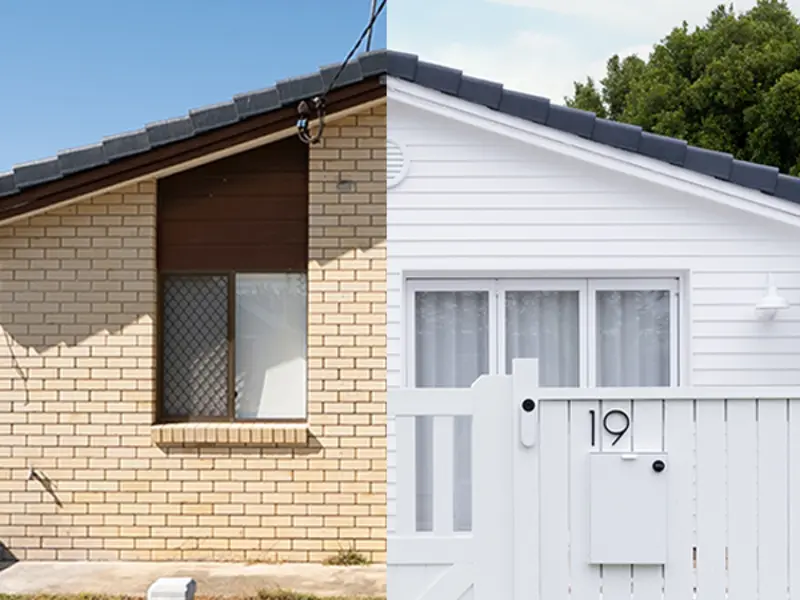
Selecting the right white for your home’s interior or exterior can be challenging. “The first step in selecting the perfect white for your home is to understand how to read paint colours. You can do so by determining the colour’s temperature, undertone and the effects of natural and artificial light sources,” explains Wattyl Colour Consultant, Katherine Champion. Cooler whites generally complement a more modern, minimalist or coastal vibe, while warmer creamy whites work well in traditional homes. Warm whites with a touch of grey suit a contemporary home.
In this article, we’ll break down the ins and outs of white paint, choosing a colour for your interior and exterior, and special considerations you need to make based on your home’s orientation.

Understanding colour temperature and undertones
“A colour’s temperature refers to whether it is warm or cool. Warmer colours (red, yellow, orange and pink) are associated with sunshine and fire, while cooler colours (blue, purple and green) are linked to the sea and sky,” says Katherine. Your preference of warm or cool is entirely up to your taste – think about the colours you love and resonate with and go from there.
But here’s where it gets tricky. “All colours start from somewhere and have an undertone. When selecting white and neutral paint colours, it is important to analyse the undertones to ensure that they work together with all the other colours in your scheme,” says Katherine.

With whites and neutrals it can be quite difficult to perceive those subtle hints of colour. “Compare, compare and compare,” Katherine emphasises. “Look at your colour choice in different lights and angles, as well as next to a pure white piece of paper.”
Keep undertones in your base colours consistent in all your colour choices helps to create a harmonious scheme. Consider hardscaping, doors and windows, flooring, furniture and décor together when selecting paint colours to avoid a mix of warm and cool undertones.

Lighting will also impact the undertones of a colour, which will be more prominent in spaces with a lot of natural light. Under cool LED lights, cool and warm whites will appear much cooler.
Consider your colour in both natural and artificial light
“Light can dramatically influence the mood and style of your space, so it is really important to take the time to consider both natural and electric light and how it will affect your colour choices,” explains Katherine. If you prefer cool whites, for example, you really need to have good natural light so they don’t appear too icy.
Include a mixture of different lighting types in a room apart from only LEDs, such as table lamps, floor lamps and pendants in a mixture of large and small sizes to create a sense of balance.
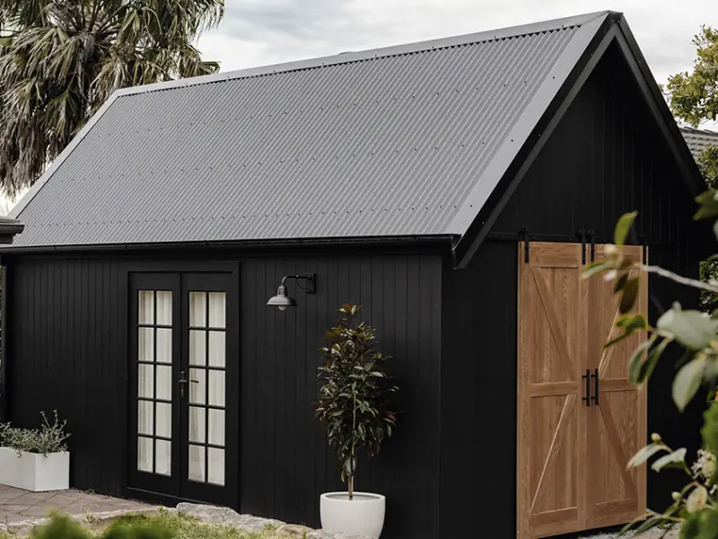
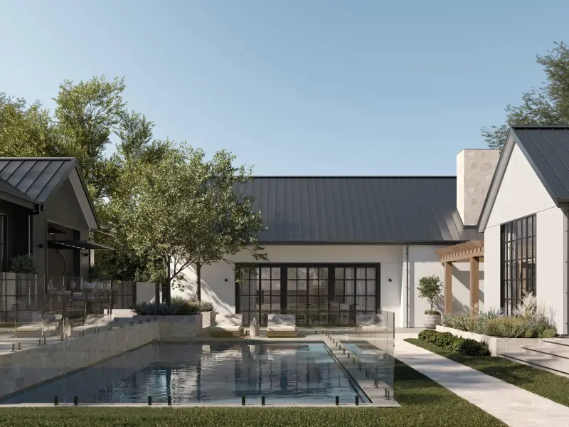
How to choose white paint for an exterior palette
When selecting an exterior colour palette, look at the colours in the surrounding environment for inspiration. It’s important to consider the colours in daylight in full sun and in the shade, as they will look very different.

“If you are looking at a whiteexterior colour scheme for your home, we recommend a white that has a Light Reflectance Value (LRV) of 85 or less, so it’s not too bright,” says Katherine.
The LRV indicates the amount of light a colour reflects. Darker colours absorb more light and heat, while whites and light neutrals keep your home cooler by reflecting light. Whites with a touch more tint or a grey undertone will reduce sun glare and show up less dirt.
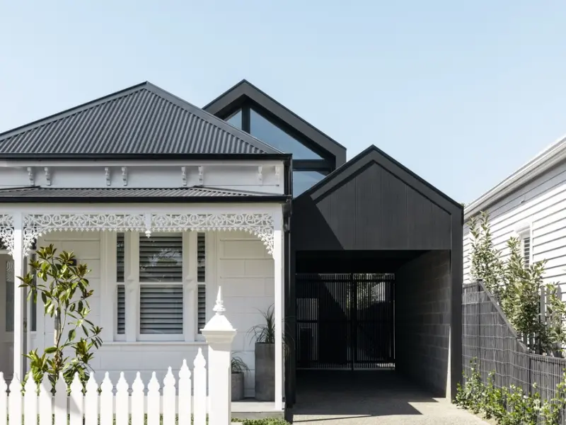
Sun orientation and exterior paint colour
In full sun, colours will look about 30 per cent lighter on an exterior, so it’s important to consider the effects of sunlight on your exterior colours.
“A white will always look cooler on a south-facing wall, even if it is a warmer white, as it doesn't receive direct sunlight. On a western wall that receives a warmer, orange afternoon sun, the exterior will look warmer,” says Katherine.

It’s also important to note that textured and matte surfaces absorb more light and have a lower LRV. You should test samples of all exterior materials intended to be painted, including exterior cladding.
How to test your colour samples
“Once you narrow down your colour selection, purchase sample pots and test a large sample area painted in two coats to view a more accurate representation of the final result,” Katherine explains.
For an interior, paint a sample in an area that receives a lot of natural light and an area such as a hallway which doesn’t.
For an exterior, “test on a north or west-facing wall, as well as a southern wall, to get a feel for the colour. If you would prefer not to test directly on the surface, paint two coats on a large thicker piece of cardboard or MDF,” recommends Katherine.
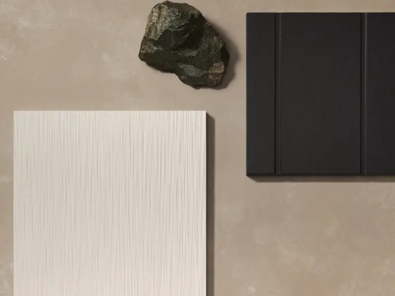
Exterior cladding samples from James Hardie can also help visualise your design decision and can be painted in any colour to suit the vision you have for your dream home. Alternatively, select to have your sample painted in a colour of our choice so you can quickly imagine the finished look of the material. Our samples are cut to approximately 20cm x 20cm.
Order a Sample
Ready to specify Hardie™ fibre cement products in your next project? Order a sample to help visualise your design decision. Paint samples in any colour to suit the vision you have for your dream home.

Look at your testing samples at different times of the day, in different weather conditions, and with the lights on and off for interiors, as the surroundings impact how colours appear.

BREAKOUT: Top 5 Warm Whites
Wattyl®Calcium: A much-loved warm white with a hint of grey.
Dulux®Natural White™: Its subtle warmth provides the perfect backdrop for decorating.
Haymes®Pulp White 1: Soft and soothing with a touch of tranquillity.
Wattyl®First Snow: Delicate, fresh and elegant warmwhite.
Dulux®Hog Bristle® Quarter: A sophisticated, neutral white that brings a lovely ambiance.
BREAKOUT: Top 5 Cool Whites
Wattyl®Feather Dawn: A soft and neutral coolwhite, popular for exteriors.
Dulux® Lexicon® Quarter: A cool fresh white is the perfect choice for modern vibes.
Haymes®Greyology 1: Crisp, elegant with hints of grey.
Wattyl®Earth Child: A fresh, greyed-off white.
Dulux®Vivid White™ An ultra-pure white that creates a clean, contemporary look, great for trims.
Ready to test some colours? Order a sample today to get started.