Orton Haus' divine duplex design
When Justine and Luke Orton of Orton Haus realised they had a redevelopment opportunity in their own Orton Building warehouse site, they were thrilled.
Having recently completed the renovation of their own home, they’d built a large following on Instagram who were keen to see more of the stunning coastal flair and home design they had quickly become renowned for.
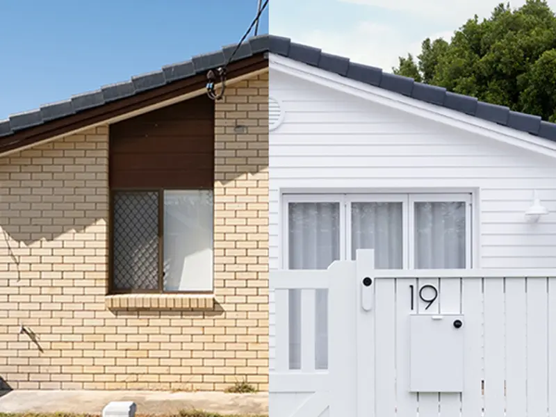
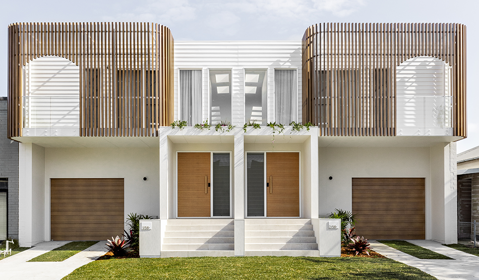
Justine and Luke decided to convert their warehouse into a Modern Coastal duplex – a pair of homes that share a common central wall – while documenting their trials, tribulations and ultimate triumphs along the way.

“As Orton Building, we build high-end, architecturally designed, residential homes,” explains Justine. “Luke's been running Orton Building for about 15 years now. We have a team of 10 and we work on builds within the city of Newcastle, mainly the coastal towns like Merewether and Bar Beach.”
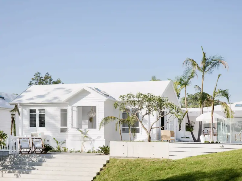
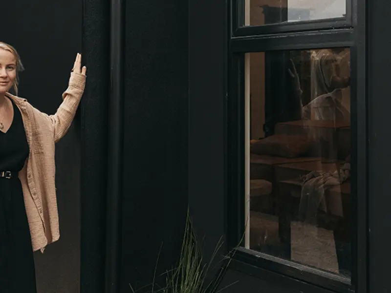
Justine’s background in PR and passion for interior styling made her a natural fit to join her husband’s business as it grew. Her signature style is modern coastal with a hint of urban sophistication, which has captured the imagination of their dedicated following.
Challenges overcome
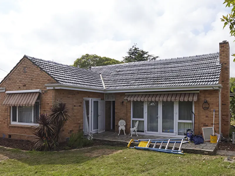
To make the most out of the floor plan and maximise the square metreage of the duplex design while retaining three existing walls required some clever thinking.
If the walls were knocked down, the council would class the project as a new build, which would mean the boundary wall would have to move and there would be significantly less space to play with. “It made sense in more ways than one to retain them, and we could see how they could easily be transformed,” says Justine.
Two homes, one seamless duplex exterior
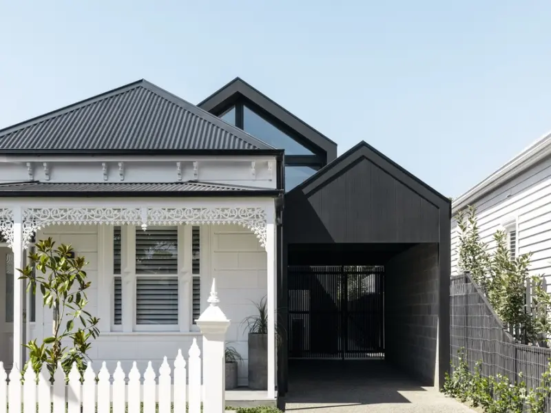
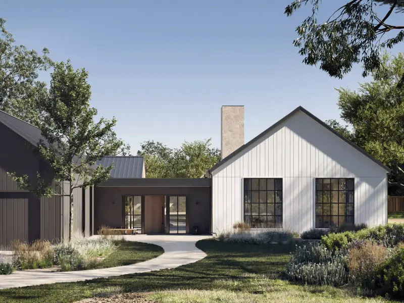
While the two homes would present as mirror images externally, Justine knew she could give each a unique interior flair. As the duplex is located in Wickham, NSW, where there’s an eclectic mix of houses and an industrial vibe, she opted for a darker palette inside and out, giving a traditional coastal-style home a modern twist.
“We wanted it to flow from the outdoors in, but we were still able to keep it neutral and keep a couple of things the same between the houses inside, like flooring,” she says.

“We didn't want it to be too coastal and still be a bit modern and fresh, so the Hardie™ Brushed Concrete Cladding works really well. It ties with the half warehouse-conversion, half new-build vibe we were going for.” – Justine Orton, Orton Building
The look of concrete render without the fuss
The original plan was to have a completely rendered look externally, but Justine felt that would be too coastal for the area. So when she discovered new-to-market Hardie™ Brushed Concrete Cladding, part of the Hardie™ Architectural Collection, it seemed serendipitous. “Installing it was super easy, it was so cost effective,” says Justine.
“The Hardie™ Brushed Concrete creates a slightly more industrial and modern feel compared to that fully rendered Mediterranean look.”

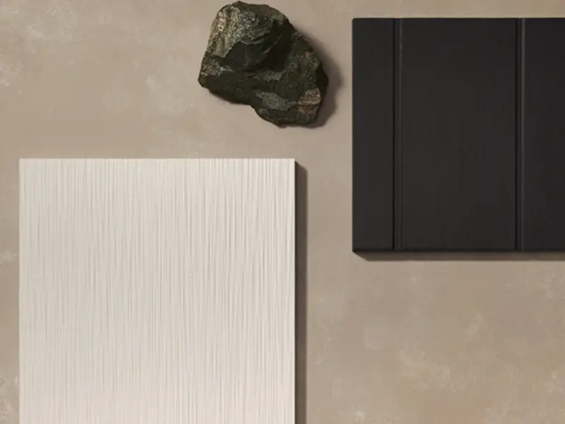
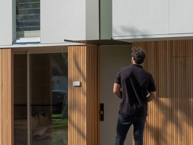
Its texture transforms with light and proximity, creating a crisp, smooth appearance from a distance that is unexpectedly detailed on a closer look.
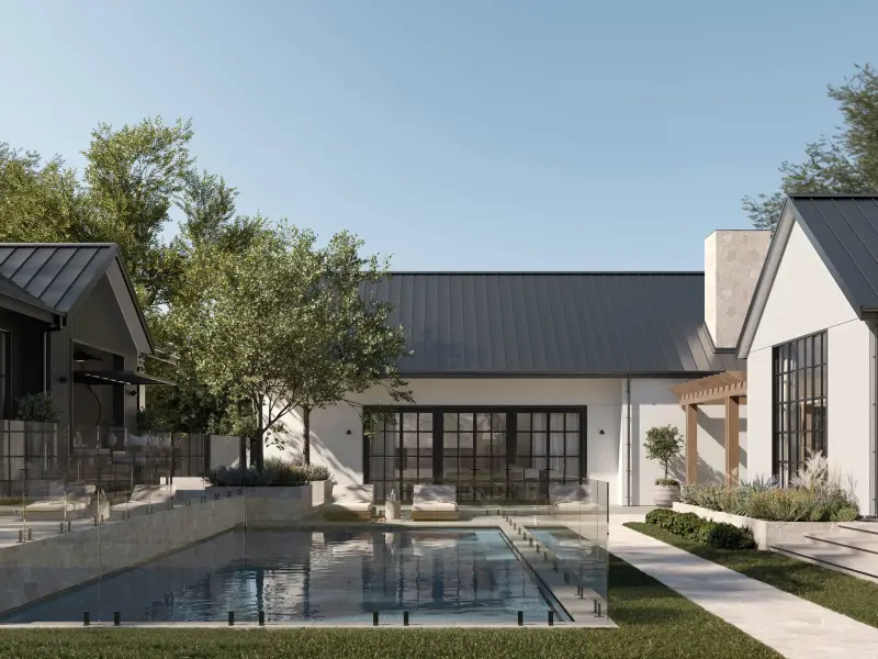
They also used the stylish cladding in the duplex’s courtyards. “We used Hardie™ Brushed Concrete cladding for this area, to also tie in with a facade,” says Justine.

BUILDER’S TIP: “The giant sheets of Hardie™ Brushed Concrete Cladding really help deliver that modern look. You get a subtle line that’s really beautiful; it gives it a modern and crisp fresh cladding look. It is seamless, in a unique way.” – Justine Orton, Orton Building
Modern match: exterior profiles with flair
As noted by Justine, the fresh, flowing lines of Hardie™ Brushed Concrete Cladding are ideal for creating modern facades with interest, giving the exterior warmth that’s both clean and uncluttered.
Her next step was to choose a material for the second storey. Created to complement each other, the products in the Hardie™ Architectural Collection offered myriad design possibilities. Justine chose the classic, coastal weatherboard look of Linea™ Weatherboard fibre cement exterior cladding, while laying the brush lines of the concrete vertically. “The Hardie™ Brushed Concrete works really well with the Linea™, because you’ve got the contrast of lines and direction.”

“We also had the timber-look screening at the top, so we had a lot of vertical lines going on. When we throw in a contrast of lines, it is visually much more appealing.” They also chose two different colours for each finish.
Justine couldn’t be happier with the results of the build. “It's fantastic. It looks beautiful. It’s got that textured look, without it looking like a kind of uneven render, it's more of a uniform look.”

Now, we all wait with baited breath for the next project by this creative duo.
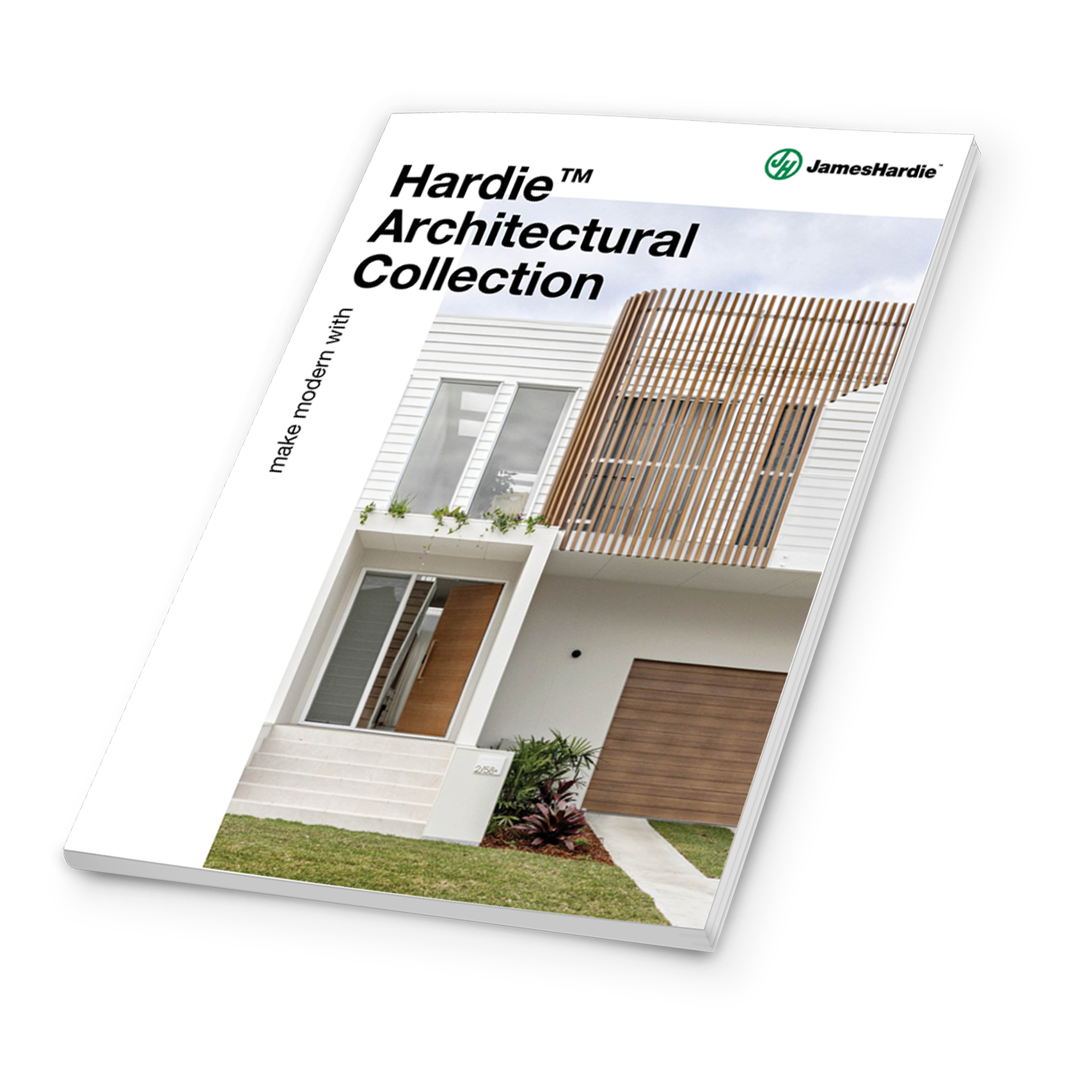
Make Modern with Hardie™ Architectural Collection
Discover the endless design possibilities of our new curated cladding collection. Everything you need to know, available in our NEW interactive magazine, from dream home inspiration to real-life case studies, top tips from industry experts and distinctive cladding combinations.
